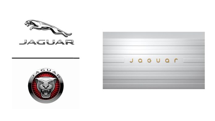
Jaguar, the iconic British luxury automaker, has just revealed a brand-new logo, and honestly, we’re a little confused. The famous company, now over a century old, says this change marks the beginning of a “new era” as they move toward an all-electric future. But, is this logo change really the direction fans were expecting? Let’s dive into it!
What’s Behind the New Jaguar Logo?
Jaguar has decided to ditch its bold, capitalized letters for a more sleek and modern look. Their new logo is designed to “celebrate modernism,” but it’s hard not to notice the noticeable change in the logo’s tone. The once strong, bold font is now softer, with gold-colored letters and a mix of upper and lowercase characters. The company says this new look represents a “seamless blend of unexpected elements in visual harmony.”
But here’s where things get tricky: The classic pronunciation of “Jag-wahr” has now shifted to the more British “Jag-you-are.” For those across the pond, this change might feel more natural, but for us stateside, it’s a bit of a head-scratcher. Does the new logo and name pronunciation feel authentic, or is it too much of a departure from Jaguar’s roots?
The Shift Towards Electric
Jaguar is also attempting to rebrand itself as an electric vehicle maker. With their upcoming electric vehicle lineup, the first model is expected to hit production in 2026. The company has already stopped selling cars in the UK and limited its presence in the US to just one model, the F-Pace SUV. It’s clear that the automaker is trying to reinvent itself, but is the new logo the right way to do it?
Say Goodbye to the Leaper?
In a surprising move, Jaguar is also retiring its iconic “Leaper” logo — the pouncing cat — after many decades. Instead, the company will be incorporating a more modern badge design that blends the letters “J” and “R” from the Jaguar name. While the rebranding is meant to represent the company’s fresh start, some fans might feel nostalgic for the classic Leaper.
Gerry McGovern, Jaguar’s chief creative officer, insists the redesign is “a reimagining that recaptures the essence of Jaguar” and makes it relevant to today’s market. He even humorously stated, “We have not been sniffing the white stuff — this is real.”
What’s Your Take?
While Jaguar clearly aims to push its brand into the future, we’re left wondering: Does this rebranding really capture the heart and soul of the legendary automaker, or does it lose something along the way? Will the new logo and logo pronunciation resonate with traditional fans, or is it too much of a departure?
We’d love to know your opinion! Do you think the new logo is an exciting step forward for Jaguar or a misstep? Leave us your thoughts in the comments below.
Conclusion: A Bold Reimagining, But Is It Too Much?
Jaguar’s rebranding is certainly a bold move as it aims to modernize its image for a new generation of drivers. While the sleek, new logo and all-electric future may excite some, it leaves us wondering if the brand has strayed too far from its iconic roots. Only time will tell whether this change will be embraced or remembered as a strange chapter in Jaguar’s history.


